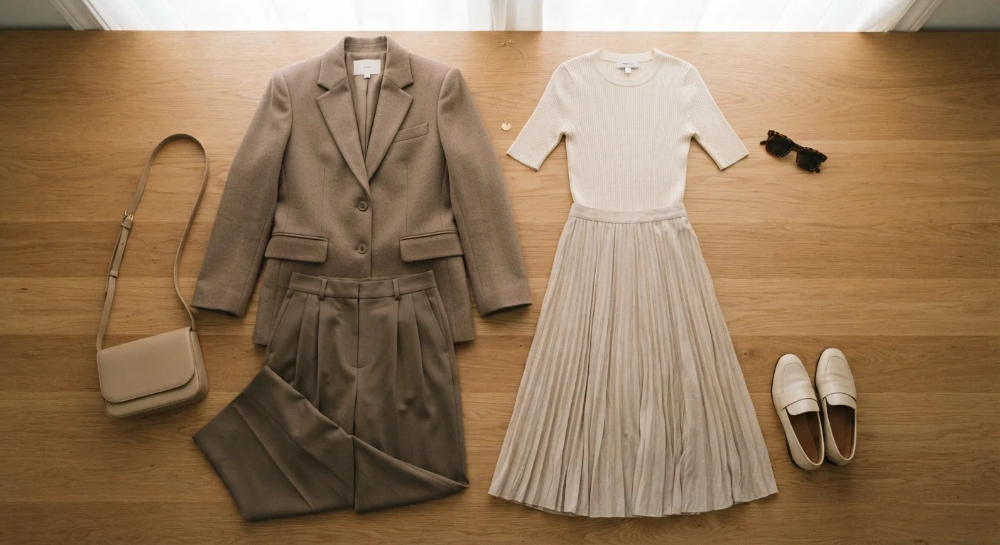
What Proportion Actually Is-and Isn't
Fashion advice has long leaned on body-type categories-'pear,' 'apple,' 'hourglass'-as a framework for dressing. The premise is that each shape has problem areas to conceal and assets to highlight. The problem: this framing treats the body as a problem to be solved rather than a canvas to dress. It's also not especially practical.
Proportion thinking is different. It's a design principle borrowed from art and architecture: the idea that visual harmony depends on how the parts of a composition relate to each other. Applied to clothing, it means asking how garments interact-not how they compare to an idealized body shape.
The principles below are tools, not rules. They describe how the eye tends to read clothing combinations, which gives you a starting point for making deliberate choices. They work across every body, every budget, and every style preference.
Proportion Is Not a Body-Typing System
Traditional 'dress for your body type' advice often implies that certain bodies need to be corrected or disguised. That framing is both outdated and unhelpful. The proportion principles in this guide are tools for creating intentional visual balance-not rules about what any body should look like. Use what's useful, ignore what isn't.
This approach also pairs naturally with understanding fit at a fundamental level. Our guide on fit versus label size explains why the number on the tag is far less important than how fabric sits on the body.
How to Apply Proportion: Step-by-Step
The steps below walk you through proportion thinking in a practical sequence-from understanding the concept to auditing what's already in your closet. You don't need to buy anything new to apply these principles.
What you will need
Full-length mirror
Allows you to assess how the full outfit reads visually from head to toe.
Tailor's tape measure
Useful for checking hem lengths and rise measurements when evaluating fit and proportion.
Smartphone camera
Taking a photo of an outfit reveals proportion issues that are harder to spot in a mirror.
Understand what 'proportion' actually means in clothing
Proportion in dressing refers to the visual relationship between the parts of an outfit-how the volume, length, and structure of one garment interact with another. It has nothing to do with your body being 'right' or 'wrong.' Instead, it's about how the eye travels across the outfit as a whole.
Think of it in terms of thirds: the human eye tends to find a roughly 1:2 or 2:1 split between top and bottom more visually interesting than a 1:1 split. A tunic that hits at mid-thigh paired with full-length trousers follows a natural proportion. An outfit where top and bottom end at the exact same horizontal line can feel visually static.
Map the volume relationship between top and bottom
The most practical proportion lever you have is volume contrast. When both garments carry significant volume-a billowy blouse with wide-leg trousers-the silhouette can read as shapeless. When both are slim-fitting, the result can read as flat or overly casual. The general principle: balance volume on one half with structure or trim on the other.
- Full skirt or wide-leg trouser → fitted or tucked-in top
- Oversized sweater or boxy blazer → slim-cut trouser or straight-leg jean
- Structured, tailored jacket → can tolerate more volume below
This isn't about hiding anything-it's about giving the eye a clear path through the outfit.
Use hem length to control where the eye stops
Where a garment ends on your body is a powerful proportion signal. Hemlines and sleeve lengths create visual stopping points that affect how the whole outfit reads:
- A jacket hem at the widest part of the hip draws attention to that horizontal line.
- A jacket ending at the high hip or waist makes legs read as longer proportionally.
- Cropped tops work well when the waistband of the bottom provides a clean continuation.
- Midi-length skirts can shorten the visual leg unless footwear extends the line.
There's no universally 'wrong' hem length-but being intentional about where hems fall helps you predict how an outfit reads rather than being surprised by it.
Decide whether to define or release the waist
Waist definition-or the deliberate absence of it-is a proportion decision, not a body-confidence one. Defining the waist creates a visual break between top and bottom, lending structure to an outfit. Releasing the waist (untucked, straight-hanging silhouettes) creates a longer, unbroken vertical line.
Practical approaches to waist definition without buying anything new:
- Half-tuck a shirt instead of a full tuck to suggest shape without structure
- Belt a dress or cardigan at the natural waist to create visual proportion
- Choose a top with a subtle hem curve-it implies shape even when untucked
Factor in how pattern and color affect perceived proportion
Proportion isn't purely about silhouette-color contrast and pattern placement change how the eye reads volume and length. A darker color on one half tends to visually recede; a lighter or brighter color advances. A bold print on the lower half draws the eye downward and can read as more volume, even if the cut is slim.
This doesn't mean dark colors are required anywhere-it means you can use color as another proportion tool. A monochromatic outfit (one color head to toe) creates a long, unbroken vertical line, which reads as elongating regardless of actual fit. Understanding color relationships adds another layer of control to proportion decisions. Similarly, pattern and texture choices interact directly with proportion.
Audit your existing wardrobe through a proportion lens
Before buying anything new, apply these principles to what you already own. Pull out tops and bottoms and pair them deliberately, asking:
- Does one item carry significantly more volume than the other?
- Where does the top hem fall, and does that feel intentional?
- Is there a clear waist moment, or does the outfit hang uniformly?
- Do color or pattern choices reinforce or work against the silhouette balance?
Many wardrobe 'problems' are actually proportion problems solvable by re-pairing, tucking, or belting existing pieces. This connects directly to the broader goal of building a versatile wardrobe that works harder with fewer pieces.
Try It in a Mirror Before You Buy
Proportion judgments are best made standing in front of a full-length mirror with the complete outfit on. A single garment on a hanger tells you almost nothing about how it interacts with the rest of what you're wearing. If you're shopping in-store, always try the full look together. If shopping online, build the mental picture before clicking checkout.
Avoid Treating 'Rules' as Absolute
Proportion guidelines describe tendencies, not laws. A bold pattern that 'should' overwhelm a petite frame might look striking in practice. Visual perception is subjective, and personal style is allowed to override textbook balance. Treat these steps as a starting point for informed experimentation, not a checklist of dos and don'ts.