Why Color Combinations Feel Confusing
Most people don't struggle with color because they have bad taste. They struggle because they never learned a framework-they're working from instinct and scattered advice that sometimes contradicts itself. "Navy and black don't mix" gets repeated constantly, yet experienced dressers break that rule deliberately and well.
The real issue is that color coordination isn't a list of rules-it's a set of relationships. Once you understand those relationships, the rules mostly take care of themselves. This guide skips the jargon and gets to what actually matters: how colors interact, why some combinations feel settled and others feel chaotic, and how to use that knowledge with clothes you already own.
If you're also thinking about how color fits into a broader wardrobe strategy, building a versatile wardrobe starts with the same principle: fewer, more intentional decisions lead to better outcomes.
The Color Wheel in Plain Terms
The color wheel organizes colors by their relationships to each other. For clothing purposes, three relationships matter most:
- Analogous colors sit adjacent on the wheel-blue, blue-green, and green, for example. They share undertones and create low-tension, cohesive combinations that are easy to wear.
- Complementary colors sit opposite each other-blue and orange, red and green, purple and yellow. They create high contrast and visual energy. Used carefully, this is striking; used carelessly, it's overwhelming.
- Triadic colors form a triangle across the wheel-red, yellow, and blue. This creates vibrant, balanced combinations that require deliberate proportioning to avoid looking like a costume.
In practice, most well-dressed outfits use analogous relationships as their base, with complementary accents used sparingly. That's not a rule-it's just what tends to read as intentional rather than accidental.
Color also intersects with how visual elements like pattern and texture behave. How pattern and texture affect an outfit explains how these layers interact-worth understanding once the color foundation is solid.
Analogous colors
Colors that sit next to each other on the color wheel. They share similar undertones, so they tend to look harmonious and low-effort when combined.
Complementary colors
Colors positioned directly opposite each other on the color wheel. When paired, they create strong visual contrast and mutual intensity.
Undertone
The subtle warm (yellow, red) or cool (blue, green) hue that lies beneath a color's surface. Undertones determine whether two colors or neutrals feel harmonious or subtly off when placed together.
Tone
How light or dark a color is, independent of which color it is. Tone contrast-not just color difference-drives how visually separated the parts of an outfit appear.
Neutral
Colors with low saturation that don't dominate a look-white, black, gray, navy, tan, and brown. They serve as anchors that make accent colors easier to use.
Saturation
How vivid or muted a color appears. A highly saturated color is bright and intense; a desaturated version of the same color appears dusty, faded, or earthy.
Neutrals: Your Coordination Foundation
Neutrals-white, cream, black, gray, navy, tan, camel, and brown-are the backbone of a functional wardrobe color palette. They don't compete with accent colors; they support them.
The most important thing to understand about neutrals is that they have undertones. Warm neutrals (cream, camel, tan, warm gray) contain yellow or red tones. Cool neutrals (bright white, charcoal, cool gray, true navy) lean blue or green. Mixing warm and cool neutrals carelessly is the most common source of outfits that look almost-right but somehow off.
A few reliable neutral-pairing principles:
- Warm neutrals generally pair well with each other-camel, cream, and brown work together naturally.
- Cool neutrals do the same-navy, gray, and white are a reliable trio.
- Crossing warm and cool can work, but needs intention. Navy and camel is a classic combination precisely because the contrast is strong enough that the undertone difference becomes part of the look rather than a mistake.
When building toward a cohesive wardrobe, choosing your wardrobe approach affects how many neutrals you'll need and how central they become.
Test Neutrals Side by Side Before Wearing
If you're unsure whether two neutrals share undertones, hold them next to each other in natural light before putting them on. A warm cream and a cool bright white will look mismatched immediately-this takes two seconds and prevents the most common coordination mistake.
Contrast, Tone, and Why They Matter
Tone refers to how light or dark a color is. Contrast is the difference in tone between the colors in an outfit. This is often more important than which specific colors you choose.
High-contrast outfits-black trousers with a white shirt-create clear visual separation between pieces. Low-contrast outfits-camel trousers with an ivory blouse-blend more smoothly, creating a longer, more unified silhouette. Neither is inherently better; the choice depends on the effect you want and the context you're dressing for.
Where contrast creates problems is when it's inconsistent without purpose-a medium-tone top, light-tone trousers, and dark-tone shoes can look like three unrelated pieces rather than an outfit. A simple fix: anchor your contrast intentionally. Decide whether this outfit is high, medium, or low contrast, and let that guide your choices for each piece.
Inconsistent Contrast Is the Invisible Culprit
When an outfit looks slightly off but you can't explain why, unplanned contrast variation is often the cause. Check whether your pieces share a consistent contrast logic-all high, all low, or a deliberate gradient-rather than mixing levels randomly across top, bottom, and shoes.
Proportion and silhouette interact with contrast too-how visual proportion works in clothing covers this in more depth.
Putting It Together: Practical Combination Strategies
With the underlying concepts in place, here are the approaches that work consistently in real wardrobes:
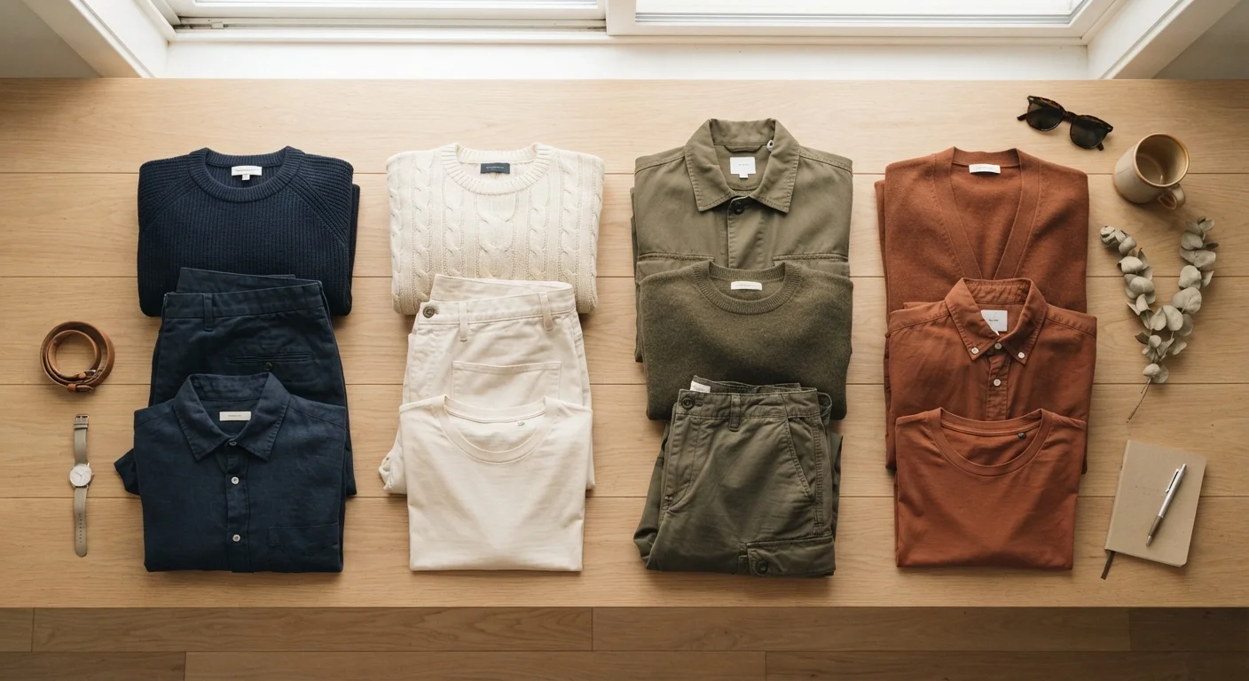
- Neutral base, one accent: Build the outfit from neutrals, then add a single item in an accent color. The accent color draws attention; the neutrals keep it grounded. This is the lowest-risk approach and works for almost any occasion.
- Tone-on-tone: Wear different pieces in the same color family but varying tones-dusty rose, blush, and deep burgundy together, for example. The key is varying the tones enough that each piece reads as distinct rather than mismatched.
- Analogous palette: Choose two or three colors that sit adjacent on the wheel and build the outfit from those. Rust, terracotta, and olive is a common example. Add a neutral to anchor if needed.
- Complementary accent: Use a color's complement only as an accent, not an equal partner. Navy outfit with a single orange detail-a scarf, shoes, or bag-works because the complementary color is proportionally small.
Before investing in new pieces to test these strategies, run through a pre-purchase checklist to make sure each item will actually integrate with what you already own-not just work in isolation.
Color Wheel Reference Chart
A printable or digital color wheel helps you visually identify analogous, complementary, and triadic relationships in seconds. Useful when shopping or building new combinations from your existing wardrobe.
Capsule Wardrobe Planner
A structured template for auditing your current clothing by color and identifying gaps. Helps you see which neutrals and accent colors you already own and where coordination is breaking down.