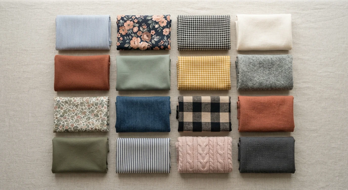
What Each Element Actually Does
Pattern, texture, and print are often treated as interchangeable words, but they refer to distinct things. Getting the terms straight makes it easier to think clearly about why an outfit works or doesn't.
Pattern refers to a repeating visual structure in a fabric - stripes, plaids, houndstooth, checks. The pattern is built into the weave or construction of the cloth itself. Print is a design applied to the surface of a fabric after construction - florals, abstract shapes, photographic images. Texture is the surface quality of the fabric - whether it's smooth, nubby, ribbed, brushed, or shiny. Texture is often felt as much as seen, but it has a strong visual effect because of how it catches and scatters light.
Each element communicates something independently. A windowpane plaid reads as structured and tailored. A floral print reads as relaxed or romantic depending on scale and color. A bouclé texture reads as tactile and luxurious even in a neutral color. These associations aren't rules - they're tendencies shaped by cultural context and visual habit. Understanding them gives you tools, not restrictions. For a broader foundation, see core wardrobe principles that apply across all styling decisions.
How Scale and Contrast Control Visual Weight
The single most useful concept when working with pattern and print is visual weight - how strongly an element draws the eye. Two factors govern it most directly: scale and contrast.
Scale is the size of the repeating element. A large-scale plaid covers more visual territory and reads from farther away. A small-scale ditsy floral blends together at a distance and reads almost like a texture. This matters because large-scale patterns draw more attention to the area of the body they cover. That's not good or bad - it's directional information you can use. For more on how scale interacts with the body, proportion in practice covers how visual elements frame the wearer.
Contrast is the difference between the motif and the background. A black motif on a white ground has maximum contrast and jumps forward visually. The same motif in navy on cobalt barely registers. High-contrast prints advance; low-contrast prints recede. This is why a high-contrast stripe can feel bold and graphic while a tone-on-tone jacquard reads as quietly refined.
3-5 feet
Distance at which large-scale patterns become readable
Fashion educators commonly note that pattern legibility depends heavily on viewing distance - large motifs read clearly from several feet away, while small repeats merge into texture.
1 shared color
Minimum color link for successful pattern mixing
Styling guides consistently identify at least one shared color as the baseline requirement for two or more patterns to read as intentionally coordinated rather than clashing.
Mixing Patterns and Textures Without Clashing
Mixing patterns is one of those styling moves that looks effortless when it works and obviously wrong when it doesn't. The difference usually comes down to three variables: scale contrast, color linkage, and the number of competing elements.
The most reliable approach: vary scale significantly. A wide horizontal stripe paired with a small geometric works because the two patterns occupy different visual frequencies - they don't compete for the same reading. Pair two similarly sized, similarly complex patterns and the eye struggles to settle.
Color linkage means the patterns share at least one color. This creates visual coherence even when the motifs are very different. A red-and-white gingham with a floral that includes red reads as intentional. The same gingham with an unrelated print in completely different colors reads as accidental.
Texture mixing follows similar logic. A smooth woven trouser with a ribbed knit sweater works because one surface is matte-flat and the other is dimensional - they contrast without competing. Combining two heavily textured pieces - a bouclé jacket over a cable-knit turtleneck - risks visual noise unless the colors are kept very close.
The 'One Statement Piece' Rule
If you're uncertain about a combination, let one piece carry the visual weight and keep everything else low-key. One bold print or heavily textured piece per outfit is a reliable default. This isn't a hard rule - it's a starting point that you can build confidence from as you develop your eye for what works.
Solid pieces are the unsung tool in pattern mixing. A solid-color item in a fabric with interesting texture - a brushed flannel shirt, a matte crepe skirt - gives the eye a place to rest without eliminating visual interest. Think of solids as punctuation in a sentence: they give rhythm to the louder elements around them. This also connects to how color relationships work - the same principles of balance apply to both color and pattern.
Putting It to Work Before You Buy
Most wardrobe missteps involving pattern and texture happen at the point of purchase, not the point of dressing. A print looks great on the rack in isolation; at home, it refuses to pair with anything already in the closet.
Before buying a patterned or heavily textured piece, think through a few questions: Does it share a color with items you already own? Is its scale dramatically different from other patterns you wear, giving it mixing potential? Does it work as a standalone statement piece, or does it need a specific pairing to function? And does the visual weight of the print or texture match the occasion range you need it to cover?
A pre-purchase checklist that includes fit and fabric should also account for how a piece will interact visually with your existing wardrobe. Fabric type itself influences how pattern reads - a matte linen and a shiny polyester can carry the same printed design very differently. For more on that dimension, fabric type and its practical effects is worth understanding alongside pattern and texture. Fit also shapes how a pattern drapes and moves - a poorly fitted garment distorts the pattern repeat in ways that affect the whole read of the outfit.